


WELCOME TO YOUR DASHBOARD
Home
Community
My Products
Settings
Carousel
Instructions
Carousel Instructions
Features of your new Carousel Plug-In
Two side-by-side images

Image change when hovering with your cursor (optional)
Appearance of a “Learn More” button when hovering with your cursor (optional)
Left and right arrows that rotates one image per click in respective directions.
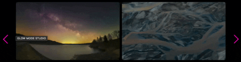
A progress bar that moves respective of the arrow clicks, indicating where you are in carousel location
Implement your new Carousel Plug-In
Follow these steps to add the Carousel Plug-In to your website. The process involves inserting custom code and configuring a new section on your page.
01
Insert code into your website
Add the required scripts to your website’s header and footer
02
Add a new section to your page
Create and configure a section with the #carousel anchor link
03
Add content to your Carousel Plug-in Section
Build your image clusters with captions and optional features
01 Insert code into your website
Step 1: Navigate to Custom Code
In the left menu, select “Website” > “Pages”.
At the bottom of the left menu, select “Custom Code” > “Code Injection”.
Header Script
Step 2: Add Scripts
Into the HEADER text box, paste the header script
Into the FOOTER text box, paste the header script
<script src="https://www.glowmodestudio.com/s/carousel_header_live.js"></script>
Footer Script
<script src="https://www.glowmodestudio.com/s/carousel_live_v1-4.js"></script>
Note that you may have been provided a slightly different purchase.
02 Add a new section to your page
On the page you would like to add the Carousel Plug-In, add a new section.
1
4
Enter editing mode
Click the EDIT button in the top left corner of the page.
2
Set the anchor link
Add a new blank section
Click “ADD SECTION then choose “+ Add Blank”
In the "Design" tab, edit the "Anchor Link" to #carousel
3
Edit the section
Click “Edit Section”
03 Add content to your Carousel Plug-In section
Enter editing mode by clicking the EDIT button in the top left corner of the page.
Add image clusters
Each cluster consists of images and text blocks that work together to create your carousel content.
1
Add Image Blocks
Add 1-2 "Image" blocks per cluster, a primary image and/or a secondary "on-hover" image.
2
Add Text Blocks
Add 1-3 “Text” blocks per cluster, two captions and/or a tag.
3
Repeat for Multiple Clusters
You may add as many clusters as you wish.
> Image block requirements
A left image
This is the primary image that will appear in the carousel.
A right image (optional)
This is the secondary image that replaces the primary (left) image when the user hovers with their cursor. If this second image is excluded, then only the primary image will appear. This image must appear to the right of the primary image, and must be situated closest in proximity and vertical space to its associated primary image than the other images in other clusters.
> Text block requirements
Caption 1 (required)
This is the primary caption to the image. The formatting you choose for this caption will determine its appearance. This caption must be located closest to its respective cluster, and situated above the optional secondary caption. If you do not want a caption, simply include a text block with a space.
Caption 2 (optional)
This is the secondary caption to the image. The formatting you choose for this caption will determine its appearance. This caption must be located closest to its respective cluster, and situated below the primary caption.
Tag (optional)
This is the name given to another page in your website to which the user will be directed when the "Learn More" button is clicked. The tag must lead with a "#", and if excluded, the "Learn More" button will not appear.
> Important guidelines
You may delete any items that are "optional." If you delete any required item, then that cluster will not appear.
You may add as many clusters as you wish.
As you add clusters, ensure that the items within that cluster are situated as described above. The plug-in works so that items situated closest are identified as belonging to that cluster.
The font styles and colors follow those specified by the section within which they are situated. If you would like to change the theme, simply edit your styles. Specifically, the progress bar is linked to the colors for "Toggle Color - on" and "Toggle Color - off"
Example Configuration

The screenshot shows a Square Space section of the "Glow Mode Studio" website in "Edit" mode. The page includes an independent section containing three image clusters as an example of the block configuration that will then be converted to a Carousel upon exiting "Edit" mode.
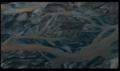
Cluster 1
Contains two images with the caption "Night" and "$599" below it. The lack of a tag (#) disables the "Learn More" button.
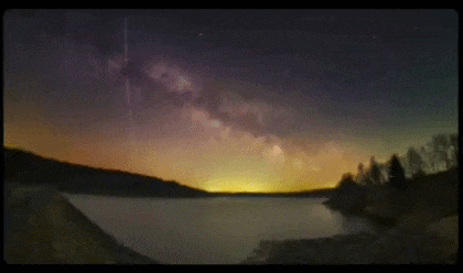
Cluster 2
Contains two images with the caption "Earth", a small "$499", and finally a #about tag that enables a "Learn More" button linking to the "About" page.
Cluster 3
Contains one with a single caption "Galaxy" and "#home" tag below it, linking the "Learn More" button to the "Home" page.